Designed a health subscription product inside a corporate benefits super-app
ViV Alelo brought medical consultations, health plans, and pharmacy discounts to Meu Alelo — designed from discovery through launch in six months, solo, across three external providers.
A health subscription built inside one of Brazil’s biggest corporate benefits apps. ViV Alelo gave Meu Alelo’s users access to health plans, medical consultations, and pharmacy discounts — with three external providers, each running on a different technical model.
Executive Snapshot
Product Situation
Alelo’s app had distribution at scale — 10M+ cardholders across Brazil. ViV added a health subscription tier across three providers with distinct service models, flow ownership, and data-sharing constraints.
Core Challenge
Design a coherent experience across three different provider architectures — real-time API scheduling, iframe-delegated purchase flows, third-party billing — while keeping LGPD compliance from killing conversion.
What Shipped
A research-validated, LGPD-compliant health subscription feature in six months: plan discovery, checkout, dependent management, prescription storage, and per-provider transactional emails.
Context
Alelo runs Brazil’s corporate benefits infrastructure — meal vouchers, food cards, transport. Meu Alelo is where their 10M+ cardholders manage those benefits. ViV was the health expansion: subscription access to wellness providers, directly inside the app.
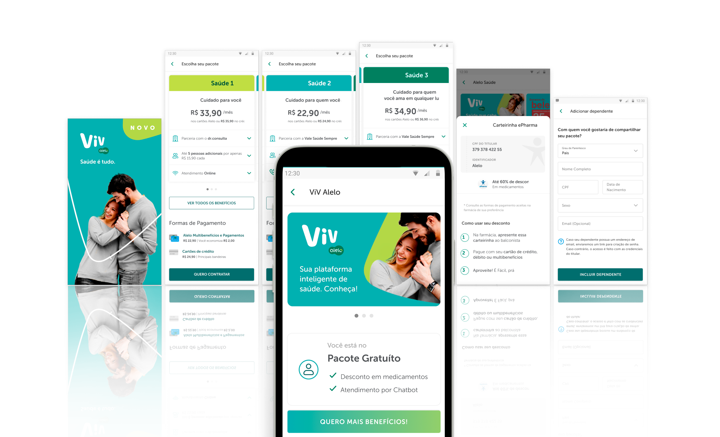
Three providers, three different architectures:
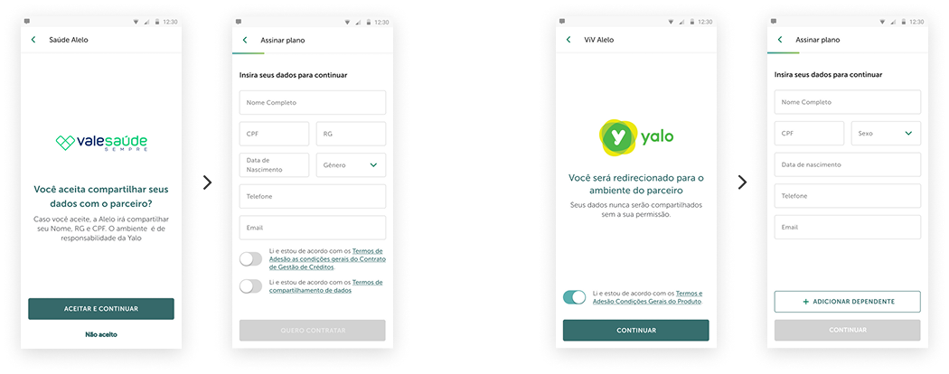
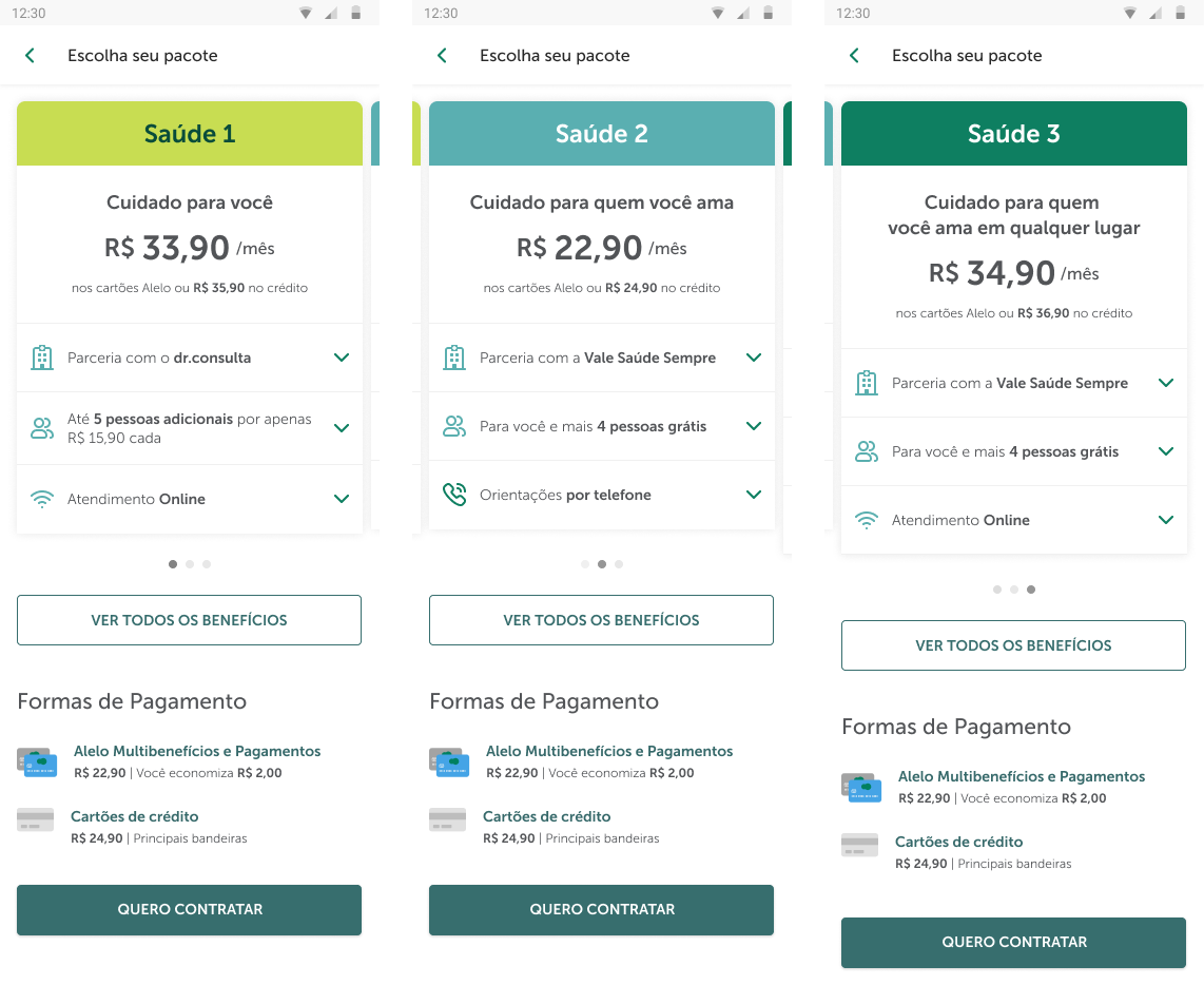
- Vale Saúde Sempre — health plans, no API. The purchase and scheduling flow lived in a provider-owned iframe. Alelo’s job was branding that iframe to match the in-app visual language, so the handoff felt seamless. Scheduling was request-based, not instant.
- Yalo — handled billing for dr.consulta appointments, acting as the checkout layer between Alelo and DRC’s scheduling service.
- dr.consulta (DRC) — real scheduling API, live availability. Users booked confirmed appointments in real time without leaving the Alelo flow.
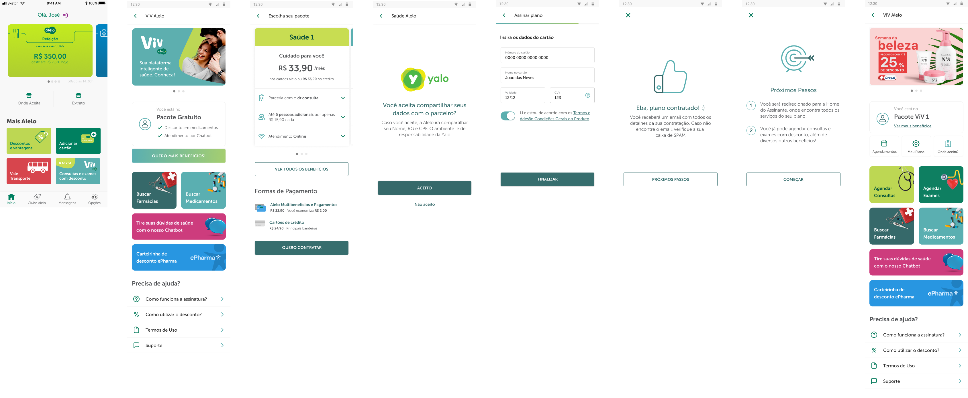
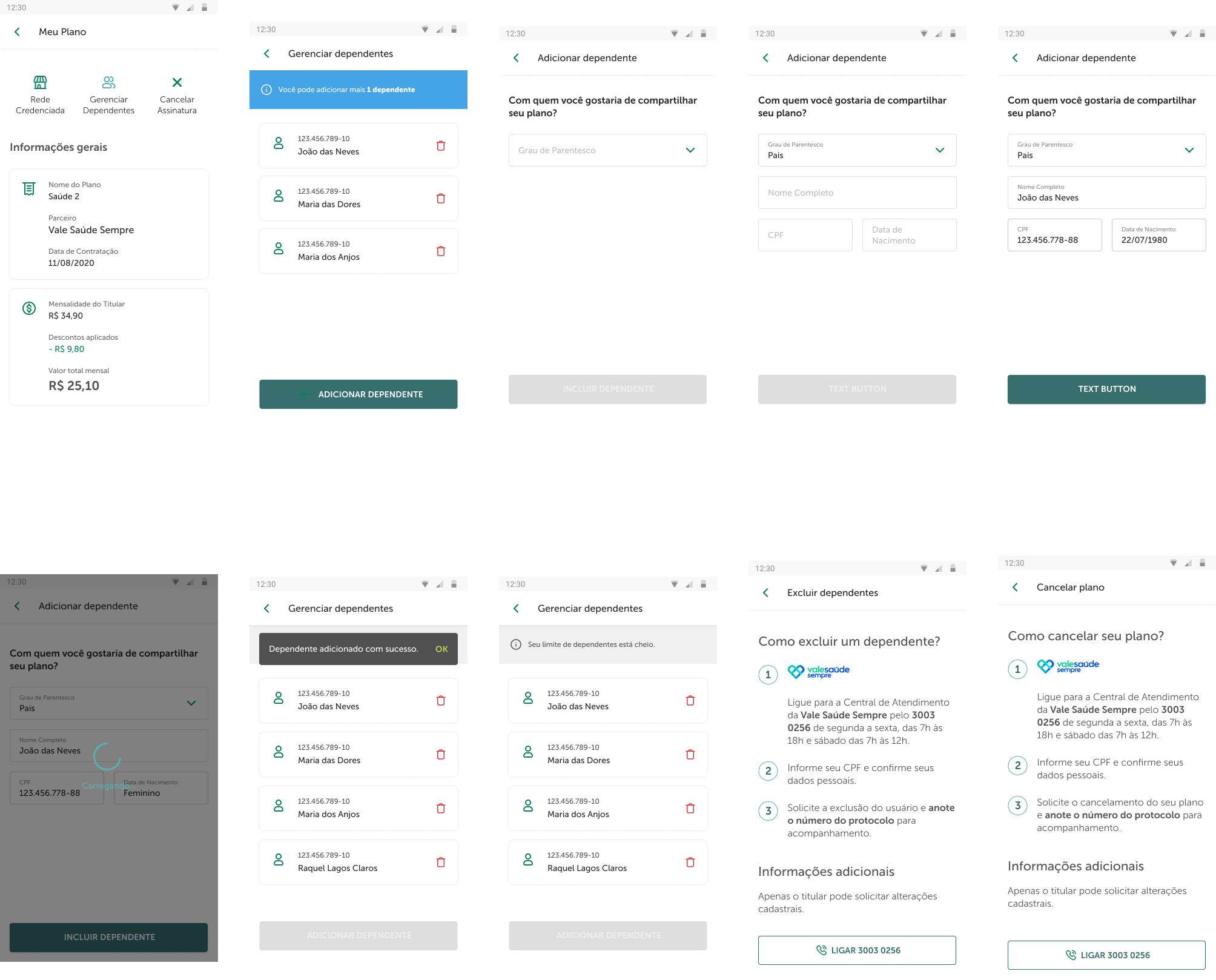
ViV also covered dependent management and prescription storage — health admin that extended the product beyond the initial subscription purchase.
Research & Discovery
Around 20 usability sessions on the MVP before final launch. Three things came out of it:
Plans slider. Too much information per card, and the swipe gesture didn’t signal that more options existed. Most users stopped at the first card. The fix was a compressed layout with clearer pagination — less visible by default, more on tap.
Banner discoverability. Validated. The ViV entry point on the home screen worked without explanation — no changes needed.
Checkout. Also validated. Low friction through to confirmation. The LGPD consent step, which we expected might cause drop-off, didn’t — as long as the copy was clear about what was being shared and why.
After the sessions I ran a team workshop to align the PM, engineers, and external devs on the prioritised changes before the next sprint.
Key Design Decisions
LGPD — consent as explanation, not checkbox.
LGPD required explicit consent before data was shared with each provider, and each provider needed different data. The consent screen wasn’t bolted on at the end — it was a designed moment: this is what’s being shared, this is who gets it, this is why. Provider-specific screens for Vale Saúde and Yalo. The testing confirmed it: specific copy didn’t read as friction.
Plan discovery — less on first view.
Plans varied in price, coverage tier, and provider. The slider was doing too much. The solution was compression: show the essentials, expand on demand. ePharma pharmacy discounts were part of the ViV package too — surfaced in plan details rather than the main selection flow.
Dependents and prescriptions.
Users needed to add dependents and manage prescriptions once subscribed. These turned ViV from a purchase funnel into something more persistent — with their own entity model and their own place in the LGPD framework.
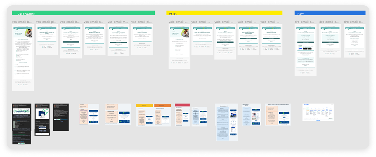
Transactional emails — per-provider.
Three providers meant three separate email systems. I designed a full set for each — Vale Saúde Sempre, Yalo, and dr.consulta — adapting visual language and tone per provider while keeping the Alelo context consistent throughout.
Impact
- 0→1 in 6 months — research-validated, LGPD-compliant, live inside Meu Alelo
- Low checkout drop-out — validated in testing, held post-launch
- ~20 sessions shaped the shipped UI — slider redesign, plan card compression, and LGPD copy all came directly from findings
- 3 providers, 3 email systems — per-provider adaptation across all transactional flows
Key Learning
The invisible seam is a design deliverable
The hardest parts weren’t the screens I owned — they were the edges. Branding a Vale Saúde iframe so it felt like Alelo. Communicating that dr.consulta books instantly while Vale Saúde scheduling takes time, even when both flows look similar going in. Getting the return path right after a user has technically left the product. None of that shows up in a feature list. But getting it wrong is exactly what users notice.